

The Vonder Serif Font
In the ever-evolving world of typography, the Vonder Serif Font emerges as a testament to timeless elegance and refined design. This serif typeface marries classic sophistication with contemporary sensibilities, offering designers a versatile tool for various creative endeavors. Let’s delve into the distinctive features and characteristics that define the Vonder Serif Font, making it a noteworthy choice for those seeking a touch of grace in their projects.
Timeless Sophistication in Every Stroke
At the core of the Vonder Serif Font is a commitment to timeless sophistication. Each stroke and serif is meticulously crafted, resulting in a typeface that exudes a sense of classic elegance. Whether used for formal documents, editorial design, or branding, the Vonder Serif Font brings a touch of refinement to the forefront.
Versatility Across Design Applications
The Vonder Serif Font proves its versatility by seamlessly adapting to diverse design applications. From print materials like magazines and brochures to digital platforms such as websites and social media graphics, this font maintains its clarity and visual appeal. Designers can confidently incorporate the Vonder Serif Font into their projects, knowing it will deliver a consistent and polished look across various mediums.
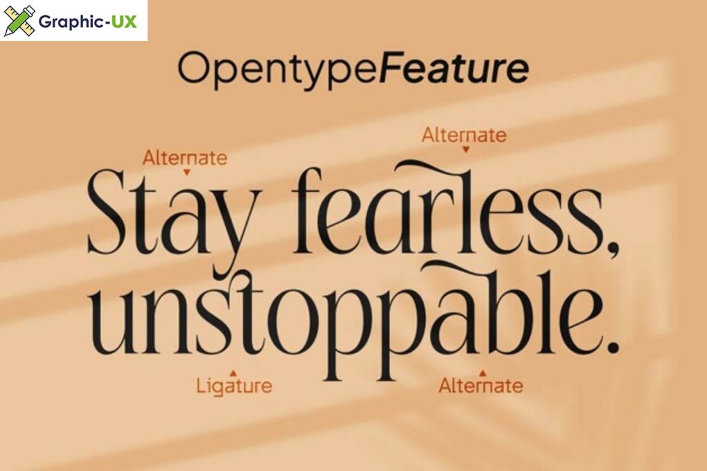
Precision Craftsmanship and Attention to Detail
Vonder Serif Font showcases precision craftsmanship with meticulous attention to detail. Every curve, every serif, and every spacing choice is purposeful, contributing to the overall harmony of the font. This commitment to detail ensures not only a visually pleasing appearance but also optimal readability in various sizes and contexts.
Elevating Brand Identities with Distinctive Typography
For designers working on brand identities, the Vonder Serif Font offers a valuable tool for creating a distinctive and memorable visual language. Its classic yet contemporary aesthetic makes it suitable for businesses and projects that aim to convey a sense of enduring quality and style. The Vonder Serif Font becomes an integral part of the brand story, enhancing recognition and recall.

Integration Tips and Design Considerations
- Pairing Possibilities: Experiment with different font pairings to discover the versatility of the Vonder Serif Font. It complements both sans-serif and other serif fonts, offering designers creative freedom.
- Hierarchy and Emphasis: Leverage the Vonder Serif Font to establish hierarchy in your design. Use it for headlines and key messages to create emphasis and guide the viewer’s attention.
- Color and Texture: Explore the impact of color and texture when using the Vonder Serif Font. Its clean lines and elegant design make it adaptable to various design elements, allowing for creative experimentation.
Conclusion
In conclusion, the Vonder Serif Font stands as a beacon of timeless elegance in the world of typography. Its refined design, versatility, and meticulous craftsmanship make it a valuable asset for designers seeking to infuse a sense of sophistication into their creative projects. Whether you’re working on a branding initiative, editorial design, or any other typographic endeavor, the Vonder Serif Font offers a classic and elegant solution. Embrace the grace and style of Vonder Serif as you elevate your design projects to new heights.