


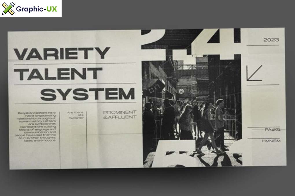
Embracing Humanity in Design: The Humanism Font Family
In the vast realm of typography, the Humanism Font Family stands out as a unique and versatile collection that captures the essence of human connection. Designed with a focus on clarity, readability, and a touch of artistic expression, this font family offers a comprehensive set of styles suitable for a wide array of design applications. Let’s delve into the features and characteristics that define the Humanism Font Family, making it a noteworthy choice for designers and creatives.
Bridging Tradition and Modernity
The Humanism Font Family strikes a delicate balance between tradition and modernity. Rooted in classical humanist principles, the font family embraces the timeless qualities of readability and proportion while incorporating modern design elements. This amalgamation creates a harmonious blend that suits both contemporary and classic design needs.
Versatility Across Design Platforms
One of the defining features of the Humanism Font Family is its versatility across various design platforms. From digital interfaces and websites to print materials such as books and magazines, the font family adapts seamlessly. Designers can confidently utilize the Humanism Font Family, knowing that it delivers a consistent and polished look across diverse mediums.
Clarity and Readability at the Core
Designed with a human-centered approach, the Humanism Font Family prioritizes clarity and readability. Each letterform is crafted with precision, ensuring that the text remains easily legible in various sizes and applications. This emphasis on readability makes the font family an excellent choice for body text in editorial design and long-form content.
Expressive Details: Crafting a Visual Identity
While prioritizing clarity, the Humanism Font Family doesn’t shy away from expressive details. From subtle serifs to unique letter shapes, these details contribute to the overall personality of the font family. The result is a distinctive visual identity that goes beyond mere letterforms, making it suitable for branding and design projects that seek a touch of individuality.
Integration Tips for Designers
- Style Pairing: Experiment with pairing different styles from the Humanism Font Family to create visual interest and hierarchy in your design.
- Hierarchy and Emphasis: Leverage the various weights and styles to establish hierarchy in your design. Use bolder styles for headlines and lighter ones for body text to guide the reader’s eye.
- Color and Texture: Explore the impact of color and texture when using the Humanism Font Family. Its adaptable nature allows for creative exploration in these aspects.