

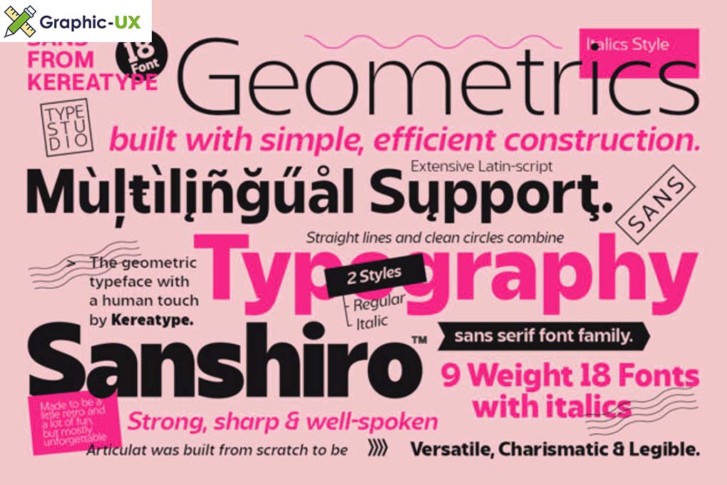
Introducing Sanshiro Font Family: Where Elegance Meets Versatility
In the expansive world of typography, the Sanshiro Font Family emerges as a distinctive and versatile collection, bringing a perfect harmony of elegance and functionality. This font family offers a comprehensive set of styles that cater to various design needs, making it a go-to choice for designers across different industries. Let’s explore the features and characteristics that make the Sanshiro Font Family a noteworthy addition to the typographic landscape.
Diverse Styles for Every Design Scenario
The Sanshiro Font Family doesn’t just offer a single typeface but presents a spectrum of styles, each with its unique personality. Whether you’re aiming for a classic and timeless look or a more contemporary and edgy vibe, Sanshiro provides a diverse range of options. From sleek sans-serif styles to more elaborate serif counterparts, this font family ensures that designers have the flexibility to choose the perfect tone for their projects.
Seamless Integration Across Platforms
Versatility is a key asset of the Sanshiro Font Family, as it seamlessly integrates across various design platforms. From print materials like magazines and brochures to digital interfaces such as websites and mobile apps, Sanshiro maintains its visual appeal and legibility. Designers can confidently use this font family, knowing that it will consistently deliver a polished and professional look across diverse mediums.
Attention to Detail: Craftsmanship at Its Finest
One of the defining features of the Sanshiro Font Family is its meticulous attention to detail. Each letterform is crafted with precision, ensuring a harmonious balance between elegance and readability. The subtle curves, well-defined serifs, and thoughtful spacing contribute to a font family that not only looks aesthetically pleasing but also performs exceptionally well in various design contexts.

Elevating Branding and Communication
For businesses and brands, the Sanshiro Font Family becomes a powerful tool in shaping their visual identity. The availability of multiple styles within the family allows for consistency in branding while offering flexibility for different communication needs. Sanshiro becomes more than just a font; it becomes a visual language that reinforces the brand’s personality and values.
Integration Tips for Designers
- Style Pairing: Experiment with pairing different styles from the Sanshiro Font Family to create visual interest and hierarchy in your design.
- Typography Hierarchy: Leverage the various weights and styles to establish hierarchy in your design. Use bolder styles for headlines and lighter ones for body text to guide the reader’s eye.
- Color and Texture: Explore how the Sanshiro Font Family interacts with color and texture in your design. Its adaptable nature allows for creative exploration in these aspects.
Conclusion
In conclusion, the Sanshiro Font Family stands as a testament to the evolving and diverse nature of typography. Its range of styles, seamless integration, attention to detail, and branding potential make it a valuable asset for designers and businesses alike. Whether you’re working on a branding project, editorial design, or web development, the Sanshiro Font Family offers a versatile and elegant solution. Embrace the richness of Sanshiro as you embark on your next design journey.