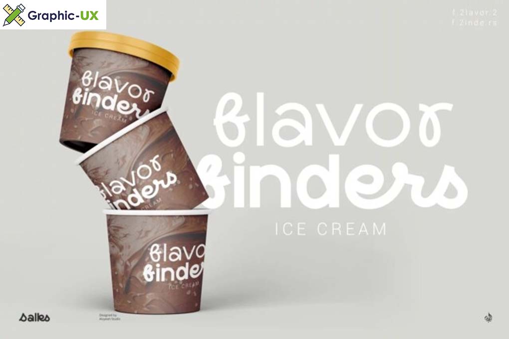
A Spotlight on the Salks Font
In the ever-evolving landscape of typography, the Salks Font emerges as a beacon of elegance and sophistication. This carefully crafted typeface is more than just a collection of letters; it’s a visual language that encapsulates style and refinement. Let’s delve into the unique features and characteristics that define the Salks Font, making it a compelling choice for designers and creatives.
Timeless Elegance in Every Glyph
The Salks Font exudes a timeless elegance that sets it apart. Each glyph is meticulously designed to embody a sense of sophistication, making it an ideal choice for projects that demand a touch of class. Whether used for headlines, body text, or creative elements, the Salks Font adds an extra layer of refinement to any design.
Versatility Across Design Applications
One of the standout features of the Salks Font is its versatility across various design applications. From print materials such as invitations and business cards to digital platforms like websites and social media graphics, the font maintains its clarity and visual appeal. Designers can confidently incorporate the Salks Font into their projects, knowing it will deliver a consistent and polished look across different mediums.
Precision Craftsmanship and Attention to Detail
Salks Font showcases precision craftsmanship with meticulous attention to detail. Every curve, serif, and line is carefully considered, contributing to the overall harmony of the font. This commitment to detail ensures that the Salks Font not only looks visually pleasing but also maintains readability, even in intricate and decorative styles.
Elevating Branding and Communication
For designers working on brand identities, the Salks Font becomes a valuable tool in shaping a distinctive visual identity. Its elegant aesthetic becomes a defining element, contributing to a cohesive and recognizable brand image. Salks Font doesn’t just convey a message; it becomes an integral part of the brand narrative, enhancing recognition and recall.

Integration Tips for Designers
- Pairing Possibilities: Experiment with different font pairings to enhance the versatility of the Salks Font. It complements both serif and sans-serif fonts, offering designers creative freedom.
- Hierarchy and Emphasis: Leverage the Salks Font to establish hierarchy in your design. Use it for headlines and key messages to create emphasis and guide the viewer’s attention.
- Color and Texture: Explore the impact of color and texture when using the Salks Font. Its clean lines and elegant design make it adaptable to various design elements, allowing for creative experimentation.
Conclusion
In conclusion, the Salks Font stands as a testament to the enduring beauty of well-crafted typography. Its timeless elegance, versatility, and attention to detail make it a valuable asset for designers seeking to elevate their creative projects. Whether you’re working on a branding initiative, designing a website, or creating print materials, the Salks Font offers an elegant solution that transcends trends. Embrace the sophistication of Salks Font as you embark on your next design journey.

