The Evolution of the PayPal Font: A Modern Design Journey
Typography is not just about letters and characters; it’s about conveying a brand’s identity, values, and user experience. The PayPal font has undergone several transformations over the years, reflecting the brand’s commitment to staying modern and relevant. In this article, we will take a journey through the evolution of the PayPal font, exploring how it has evolved to meet the demands of contemporary design and digital branding.
The Role of Typography in Branding
Typography plays a significant role in branding and design:
- Visual Identity: The choice of font can define a brand’s visual identity, conveying its character and values.
- User Experience: Typography impacts the user experience, influencing readability and user interaction on digital platforms.
- Brand Consistency: Consistency in font usage across various touchpoints helps establish a strong and memorable brand presence.
The Early Days of PayPal Typography
PayPal, established in 1998, initially used a simple and bold font for its logo and brand identity. The typography was clear, reflecting the straightforward nature of online payments.
The Transition to Futura
As PayPal continued to grow and expand its services, it recognized the need for a more contemporary and versatile typeface. In 2007, the company transitioned to the Futura font, which was chosen for its modern and geometric design. Futura offered a clean and sleek appearance, aligning with PayPal’s desire to be seen as a forward-thinking and user-friendly payment solution.
The Custom PayPal Sans
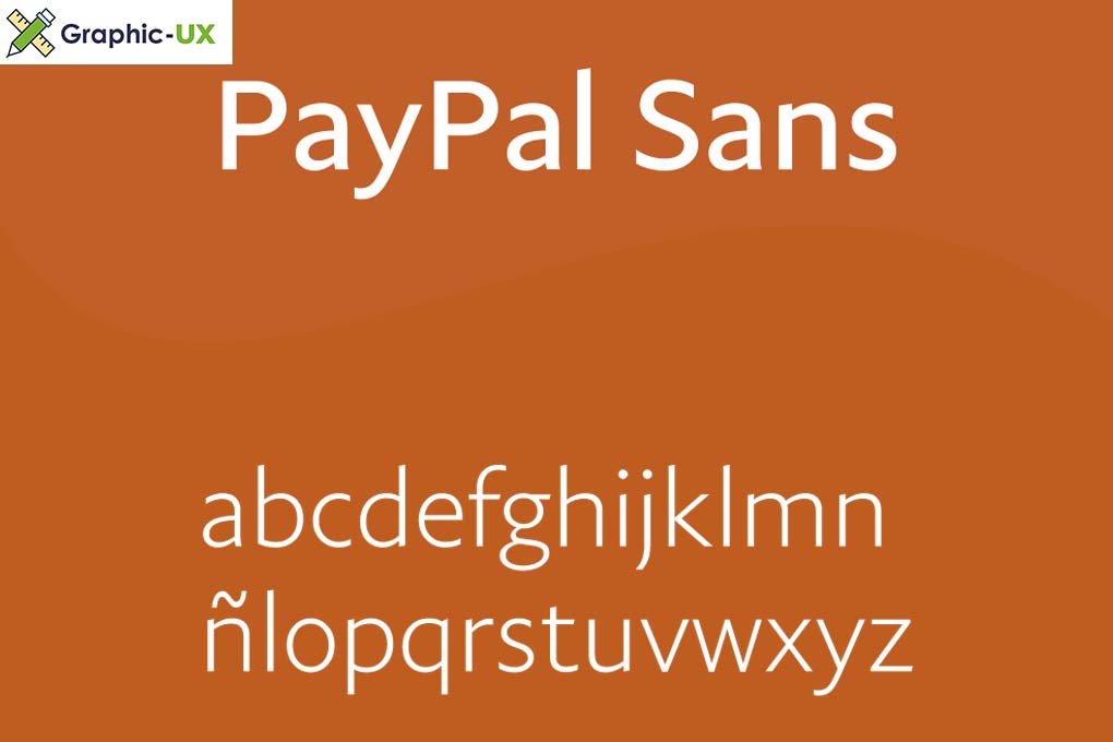
In 2014, PayPal took a bold step by introducing its custom typeface called PayPal Sans. This font was designed to be unique and memorable, reflecting the company’s growing influence in the digital payment space. PayPal Sans combined a contemporary feel with a touch of individuality, making it distinct from generic fonts and synonymous with the brand.
PayPal Sans and Modern Branding
PayPal Sans has become a cornerstone of PayPal’s modern branding efforts. Its simplicity, readability, and approachability reflect the brand’s commitment to providing a user-friendly and trustworthy digital payment experience. The font is versatile, working well across various digital platforms and devices, ensuring a consistent brand presence.

The evolution of the PayPal font showcases the brand’s dedication to staying current and relevant in the digital age. Typography is not just a visual element; it’s a fundamental part of a brand’s identity and user experience. The transition from a simple bold font to the custom PayPal Sans demonstrates how design and branding can evolve to meet the demands of a changing digital landscape.
PayPal’s typography journey serves as an example of how a brand can use fonts to convey its values and create a consistent and memorable user experience. It highlights the significance of typography in modern branding and design, where fonts go beyond mere letters and characters to become an integral part of a brand’s identity and story.

