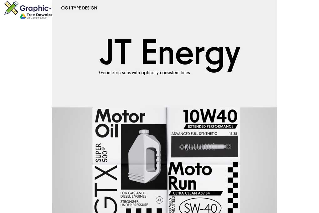
JT Energy Font
JT Energy is a new in 2020 interpreted geometric type with optically consistent line thickness and an interesting look and feel. This type is inspired by designs from Paul Renner and Arno Drescher and was long developed until it was something own.
The family is equipped with
7 cuts — light to heavy —
2 extra versions “Placard” to set very large
stylistic alternates with letterforms that are round-edgy
alternates with flat diacritics
standard and oldstyle figures
and a variable font
What makes this type unique is the slanted, edgy-sharp M, a new S and a wide f.

